

Nano Banana 2.1 Photo to Watercolor: Prompts and Checks
For a Nano Banana 2.1 photo-to-watercolor edit, use Image-to-Image and separate two requests: what should remain recognizable, and how the painted surface should look. Preserve the subject's silhouette, placement, and important features while asking for transparent washes, selective soft edges, and visible paper texture. Inspect the composition before deciding whether the watercolor effect is convincing.
Start in the Nano Banana 2.1 image editor with a photograph you have permission to edit. This guide uses an invented cottage scene to explain the brief. Its prompts are examples to try, rather than tested Nano Banana 2.1 outputs.
Google's model card includes stylization among its editing evaluation categories. That supports exploring a change of visual medium; it does not establish that a particular watercolor prompt will preserve every detail. The same card notes imperfect consistency and occasional spatial-positioning errors. Keep a source-to-result comparison in the workflow.
Choose how much detail the finished image needs
Watercolor can mean a close architectural study, a simplified illustration, or a loose wash. Decide which version serves the image's job before generating.
| Intended use | Useful direction to request | Detail to protect |
|---|---|---|
| A recognizable house or travel keepsake | Controlled watercolor with selective crisp edges | Building silhouette, roofline, entrance, and major landmarks |
| A social post or editorial illustration | Simplified shapes with a restrained palette | Main subject, focal point, and large light-and-dark areas |
| A decorative card background | Loose transparent washes and generous open paper | Overall composition and the area reserved for added copy |
These are briefing choices, not named controls or strength settings in the editor. More looseness allows more interpretation. If a client needs a specific building, face, or product to remain recognizable, approve those features before accepting expressive simplification.
A watercolor image is also a different deliverable from a faithful product photograph or an architectural record. Use the original when exact material color, dimensions, or construction details matter.
Pick a source with a readable structure
Choose a photograph whose main subject is clear at a small size. Look for separation between the subject and background, a useful crop, and enough visible detail to judge the result. Dense foliage covering half a house can make it difficult to tell whether the edit has invented new architecture.
For the cottage example, write down three composition anchors:
- One modest cottage sits on the left, with its roof and entrance visible.
- A pale footpath curves toward the entrance.
- A tall tree on the right balances the building, with open sky above.
For your own photograph, describe what is actually present. Do not add a path or tree simply because this example uses them. Keep an untouched copy of the source to check later.
Start with one reference when it contains everything needed. If you add a separate watercolor reference, assign it a limited role: it should suggest the treatment of pigment and paper, while the source photograph controls subject and layout. The reference-image guide explains how to avoid conflicting roles.
Describe the medium with visible qualities
Instead of stacking unrelated styles, name the watercolor features you want. Transparent washes suggest light color layers; selective soft edges allow less important forms to blend; crisp focal details keep the subject readable. A small amount of paper grain can support the look without becoming the main subject.
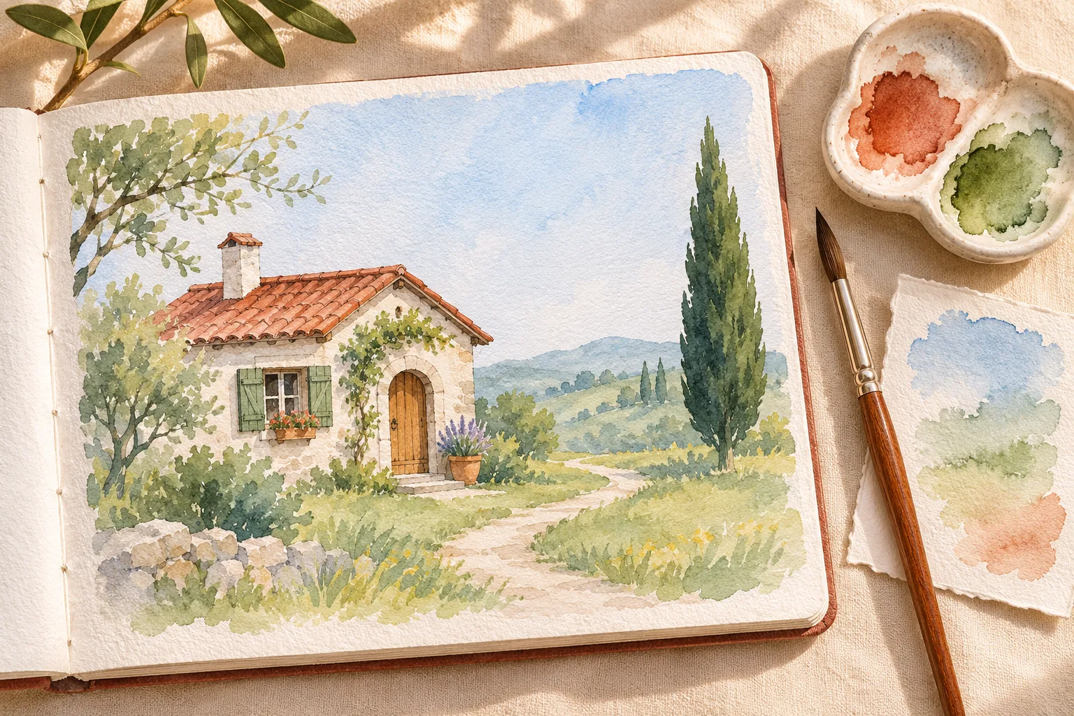
Original watercolor-planning concept illustration. This is not a Nano Banana 2.1 output sample or a photo-to-painting comparison.
Use a clear starting prompt with a suitable source photograph:
Reinterpret the uploaded cottage photograph as a controlled watercolor illustration on lightly textured cold-press paper. Preserve the original camera view, crop, cottage silhouette, roof shape, doorway position, curved path, and placement of the tall tree. Use transparent washes, a restrained terracotta and muted green palette, soft edges in distant foliage, and a few crisp details around the roof and doorway. Simplify small background clutter without adding buildings or changing the scene's layout. Keep the painting flat within the image: no sketchbook, frame, brush, palette, captions, signatures, or text.
The last sentence distinguishes a finished painting from a picture of a painting on an artist's desk. The concept illustration above deliberately shows a workspace; your downloadable artwork may need only the flat illustration.
Replace the preservation list with details from your own source. If you need broader help turning a brief into instructions, use the prompt guide.
Make a first version with a stable crop
In the editor, choose Nano Banana 2.1 and Image-to-Image, then upload the photo. Enter the prompt and choose an aspect ratio that suits the source and destination. Keeping a similar ratio makes it easier to compare placement and proportions.
Check the selected resolution, image count, and displayed credit charge before generating. One first version is useful when you are still settling the art direction. A larger image can provide more pixels, but it does not guarantee a correct roofline or recognizable face.
Review the initial result at two sizes. At thumbnail size, ask whether the subject and focal point still read. At full size, inspect structural details and the painted surface.
Check structure and painting treatment separately
Begin with the things the source controls. Count major objects, compare their relative sizes, and check important openings or facial features. In the cottage example, an attractive extra window or a relocated door is still a change to the brief. Ask whether the path reaches the correct entrance and whether the tree stayed on the intended side.
Then check the watercolor treatment. Are the washes transparent enough for the desired look? Are focal edges clearer than background edges? Does the paper texture support the scene, or obscure it? A uniformly blurry result may have lost structure rather than gained painterly softness.
For portraits, compare expression, facial proportions, hair, and distinctive accessories. Stylization can change perceived identity even when the pose remains similar. An exact likeness is a condition to review, not a promise created by the words “keep the face unchanged.”
Revise one aspect of the brief at a time
| What you see | A focused revision to try |
|---|---|
| The result still looks like a photograph | Ask for visible transparent washes and simplified small textures while retaining the same structure |
| The building or face changed too much | Return to the original source and name the specific features that must survive; reduce the requested looseness |
| Every edge is equally soft | Request clearer edges at the focal subject and softer treatment only in the background |
| Paper grain overwhelms the image | Ask for subtler paper texture without changing the palette or composition |
| A frame, signature, or painting tools appeared | Request only the flat artwork, with no surrounding objects or lettering |
Avoid repairing a changed subject by layering a new style onto an already drifting result. Reuse the original photo when the composition needs restoring. Once the structure is acceptable, refine the palette or edge treatment separately.
Set a limit on revisions. The pricing and credit guide explains how repeated outputs affect the cost of an accepted image. If a critical likeness or detail remains unreliable, manual illustration or finishing may be a better next step than another broad prompt.
Prepare the artwork for its destination
Download the accepted version and inspect the actual pixel dimensions and format. For a social graphic, check the final crop and legibility at the size viewers will see. For a card, add the approved words separately so you can control spelling, position, and typography. The poster text guide explains that finishing choice.
For print, obtain the printer's required dimensions, bleed, and file specifications. A resolution label alone does not establish print readiness. As a planning calculation, 2400 pixels across at 300 pixels per inch corresponds to eight inches before any crop; that is arithmetic, not a promised output size or a universal printer requirement. Proof the file through the intended print workflow.
Keep the original photo, chosen prompt, accepted artwork, and any finishing notes together. Then open the editor for the next variation with the same composition anchors and a single, clear change to the painted treatment.
Documentation and site workflow checked November 4, 2026. Written by the Nano Banana 2.1 team; no controlled watercolor-generation benchmark was conducted for this guide.