

Nano Banana 2.1 Posters: Write, Place, and Check Your Text
Nano Banana 2.1 can help you create a poster with a short headline, a clear visual, and supporting copy. The useful starting point is a small copy deck: decide exactly which words belong in the image and where they should sit. Then check the generated lettering separately from the design.
You can follow this workflow in the Nano Banana 2.1 image editor. This guide uses a fictional citrus-market poster to explain the process. The prompts are original examples to try, not a report of tested outputs or a guarantee of correct lettering.
Google documents improved text rendering and infographic layouts in its Nano Banana 2.1 model overview. Its model card also identifies small lettering and long passages as weaknesses. Plan for proofreading even when the overall image looks convincing.
Decide which words the image needs
For the citrus-market example, the final asset is a portrait social poster. It needs a headline, an event line, and a location. Prepare those strings before writing visual instructions:
| Copy role | Exact example text | Placement instruction |
|---|---|---|
| Headline | CITRUS WEEK | Large, on two lines, in the upper third |
| Event line | SATURDAY MARKET | One smaller line below the headline |
| Location | RIVER HALL | Bottom center, with generous surrounding space |
All three are fictional example details. Substitute approved information for your own event. Avoid asking the model to invent opening hours, prices, contact information, or claims about a product.
A short decorative headline is a reasonable generation task. A dense timetable, a long address, or copy that must match a brand font is a reason to plan a second stage in a layout editor. Generate the artwork and leave the relevant area blank; add the exact typography afterward.
Give the layout a reading order
Open the editor, choose Nano Banana 2.1, and start with Text-to-Image if you do not have an existing visual. Select the intended aspect ratio before generating. For this example, choose 4:5 for a portrait social placement; check the requirements of your actual destination before using that format elsewhere.
Describe the largest element first, followed by the subject and the smaller text. Include contrast and spacing instead of relying on “make it professional.” An orange headline over orange fruit may fit a palette but still disappear at phone size.
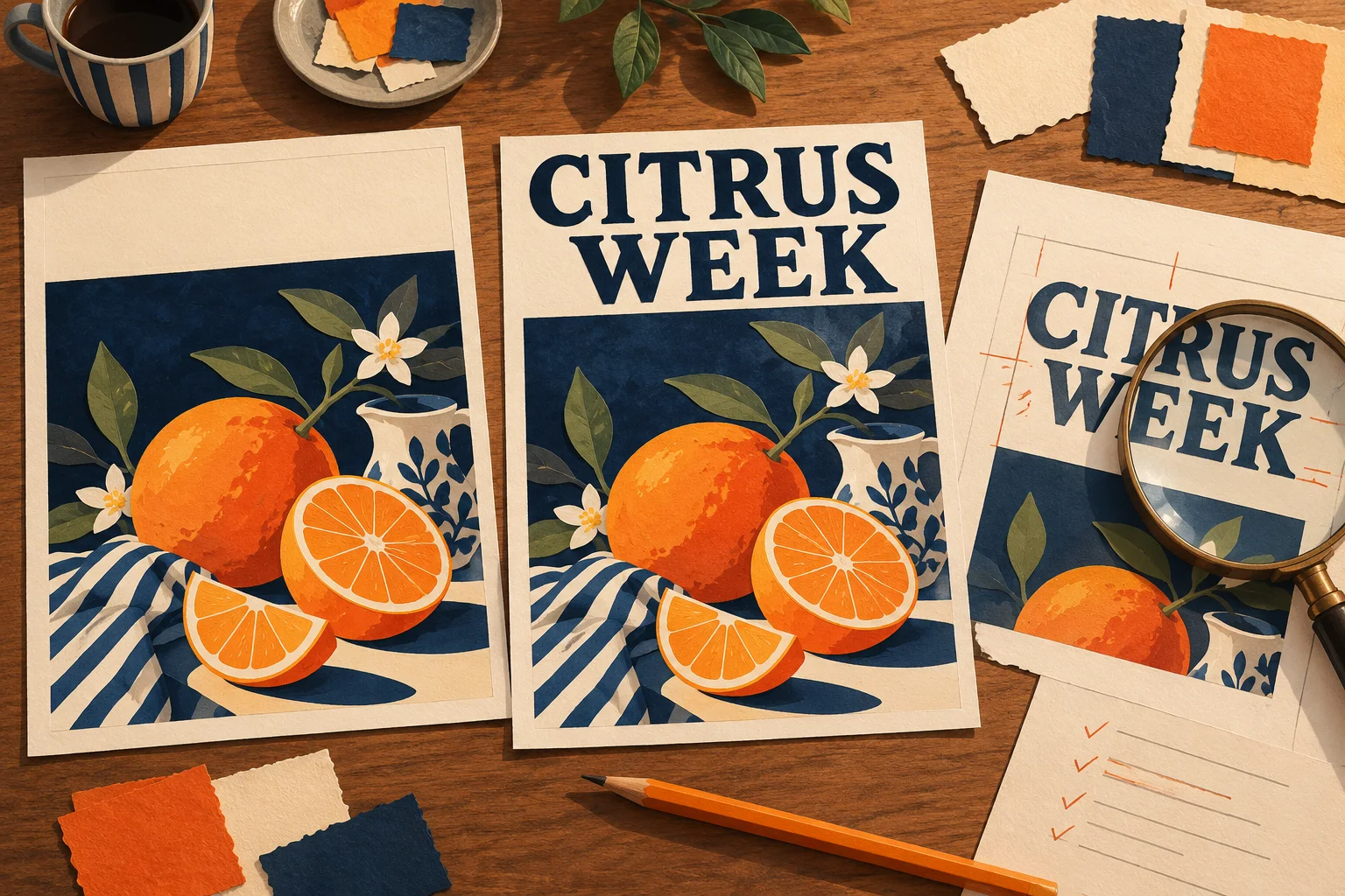
AI-generated editorial illustration of the planning process. It is not a screenshot, a Nano Banana 2.1 output sample, or evidence of text accuracy.
Try this complete brief:
Create a 4:5 portrait poster for a fictional citrus market. Use a warm cream background and an orange-fruit still life in the lower half. Reserve the upper third for a large dark-green headline. Render exactly these words: headline “CITRUS WEEK” on two lines; event line “SATURDAY MARKET” below it; location “RIVER HALL” at bottom center. Use clear, simple lettering, strong contrast, generous spacing, and comfortable outer margins. Keep fruit and leaves away from every text area. Include no additional words, logos, badges, prices, or watermarks.
The quotation marks identify the requested copy. They do not make generation deterministic. If you need a different visual direction, change the subject, palette, and medium while keeping the copy deck stable. The broader prompt guide explains how to organize other kinds of image briefs.
Choose a resolution for the current decision
Use an exploratory output to decide whether the composition works. On this site's current Nano Banana 2.1 integration, 1K, 2K, and 4K cost 2, 4, and 6 credits per output respectively, as checked on October 27, 2026. Confirm the displayed cost before submitting.
A 1K draft is useful for judging hierarchy and color. If smaller text is central to your decision, inspect a 2K or 4K output rather than treating a blurry 1K preview as the final result. A larger image can still contain a wrong letter; resolution is not a spelling correction.
Generate one output at a time when diagnosing a precise text problem. Batches are more useful when you are deliberately exploring different designs. Four 4K outputs cost 24 credits in the current configuration. See the pricing and credits guide for batch and retry calculations.
Proofread the copy in a separate pass
First compare the output with the copy deck, line by line. Check the downloaded image at full size, then view it at the size readers will actually see. A word can be correctly spelled and still be too small to read.
| Review pass | What to inspect | What to do if it fails |
|---|---|---|
| Exact copy | Missing, duplicated, substituted, or invented characters | Request one focused correction or replace the text in a layout editor |
| Reading order | Headline, event line, and location remain distinct | Simplify the layout and increase separation |
| Legibility | Contrast, crowded letters, fruit crossing the words | Move the artwork away from the text area |
| Publication details | Every factual string matches approved copy | Correct it before publishing, regardless of visual quality |
| Placement | Cropping and outer margins at the intended display size | Reframe or make a separate composition for that format |
For another language, have a fluent reader check both spelling and line breaks. Ask for the approved translated text explicitly. Do not assume that an attractive arrangement confirms the translation.
Correct one text block at a time
When the poster is mostly right, save it and use Image-to-Image to request a focused revision. Treat the request as a new generation that may alter other details. The site does not promise a layered text object or a pixel-perfect local replacement.
For example, if the location is incorrect:
In the uploaded poster, replace only the bottom location text with the exact words “RIVER HALL”. Keep the headline “CITRUS WEEK”, the line “SATURDAY MARKET”, the fruit arrangement, cream background, colors, and framing unchanged. Do not add any other text.
Check the entire revised image, including parts you asked it to preserve. If the location improves but the headline changes, do not keep repeating the same instruction without a stopping rule. Decide in advance how many retries the asset is worth. For one 1K draft, one 2K revision, and one 4K final attempt, the current generation budget is 12 credits; another attempt adds its own cost.
If the same lettering problem persists, switch methods: generate a text-free version and finish the copy in a layout editor. Downloading an image does not provide editable type layers.
Use a blank text area when precision matters most
This variant keeps the image task simple:
Create a 4:5 portrait citrus-market poster background. Warm cream paper, an orange-fruit still life across the lower half, dark-green leaf accents, and soft natural shadows. Keep the upper third and a strip at bottom center completely empty for text to be added later. Do not render letters, numbers, logos, or decorative symbols.
After downloading, add the approved headline, event line, and location in your layout tool. This gives you direct control over font, spelling, kerning, and later copy changes. It is particularly useful for repeat campaigns, multilingual versions, dense information, and client files that need editable text.
For print, check the actual pixel dimensions, intended physical size, and your printer's requirements. A “4K” setting alone does not establish bleed, color preparation, or an editable print document.
Start with one short headline and one clear image in the image editor. Keep the copy deck beside the output: the poster is ready when both the design and the words pass review.
Written by the Nano Banana 2.1 Team. Product documentation and site settings checked October 27, 2026. This tutorial describes a suggested workflow; no controlled output-quality test was performed.