

Nano Banana 2.1 Wide Banners: Plan, Generate, and Crop
For a wide Nano Banana 2.1 banner, decide the destination's shape before generating. Choose an aspect ratio that is close to that shape, place the important subject where the final crop can retain it, and reserve a quiet area for text. After downloading, check the actual pixel dimensions and inspect the panorama for repeated objects, broken lines, and awkward joins.
You can create the artwork in the Nano Banana 2.1 image editor. This guide uses an invented coastal landscape with a lighthouse on the right and open sky on the left. The prompts are original examples to try, not a report of tested model outputs.
Google's model documentation reports a fix for tiling artifacts in wide and panoramic ratios at 2K and 4K. That documented improvement is relevant to banners, but it does not establish that every result is seamless or ready for a particular website. The model card still notes spatial-positioning and detail limitations. Keep an inspection step in the workflow.
Start with the space the image must fill
Ask for the intended desktop and mobile display shapes, not just “a high-resolution hero.” A short desktop strip and a tall mobile header need different compositions even when they advertise the same thing.
| Destination shape | Useful starting direction | Main tradeoff |
|---|---|---|
| Broad landscape area | Consider 16:9 or 21:9 | More vertical room for a subject and its surroundings |
| Shallow horizontal strip | Consider 4:1 | Less room above and below the subject; small details become less useful |
| Extremely shallow panorama | Consider 8:1 only when the layout calls for it | A small change in crop can remove an important object |
| Tall mobile placement | Plan a separate portrait composition when necessary | A desktop panorama may lose most of its story when cropped vertically |
The current site's Nano Banana 2.1 option includes 4:1 and 8:1 alongside the familiar landscape ratios. Those are width-to-height relationships: 4:1 means four units wide for every one unit high. They are not fixed pixel dimensions or promises about a platform's upload requirements.
Use the actual placement requirements. If your design needs a 1600-by-400 asset, its ratio is 1600 ÷ 400 = 4, so 4:1 is a natural starting point. That example is a layout calculation, not a claim that the model exports that exact size.
Plan the subject and the text area separately
For the coastal example, the image's job is to establish a calm setting and leave room for a headline that will be added later. It does not need to render the headline itself.
Write a small composition brief:
- Subject: one modest terracotta lighthouse near the right third of the frame.
- Environment: an invented coast, continuous sea horizon, low grasses, and restrained detail.
- Text area: the left half has pale open sky and low visual contrast.
- Edges: no essential object touches the outer crop boundaries.
- Exclusions: no captions, signage, logos, duplicate lighthouses, or tiled scenery.
A quiet area still needs review. Tiny clouds, waves, or high-contrast branches can make a headline difficult to read. Add the approved copy over the artwork in your page or layout tool, then test the combination. Asking for empty space does not automatically give the text sufficient contrast.
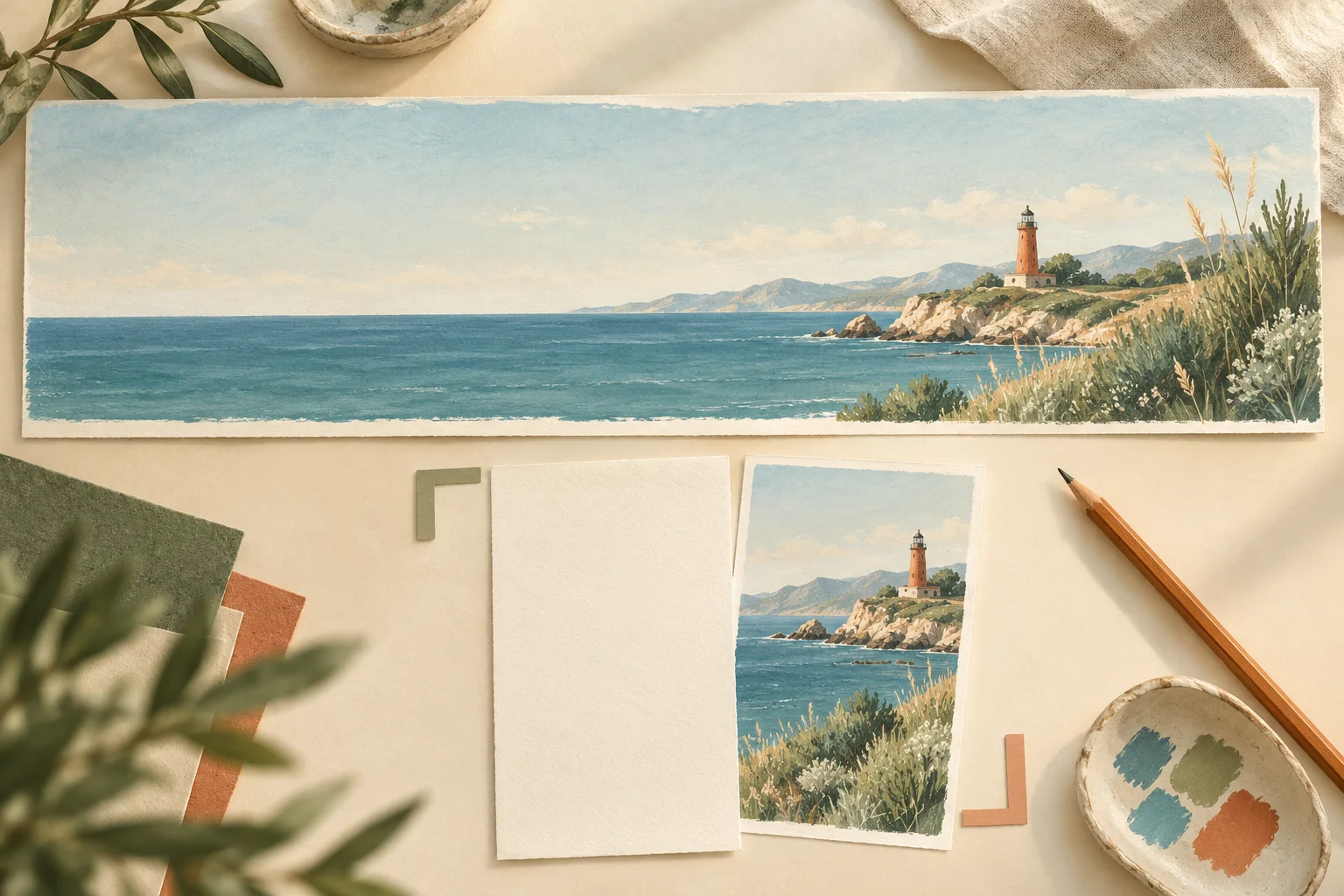
Original banner-planning concept illustration. This is not a Nano Banana 2.1 output sample or a before-and-after quality comparison.
Keep logos, prices, navigation, and important calls to action editable. For a website, real page text can be resized and adapted as the layout changes. If you do need words inside the generated artwork, the poster text guide explains how to brief and proofread them.
Generate for the intended frame
In the editor, choose Nano Banana 2.1 and Text-to-Image for a new scene. Open the aspect-ratio options and choose the ratio that matches the brief. Check the resolution and displayed credit charge before submitting.
For a 4:1 landscape, try this original prompt:
Create one continuous 4:1 horizontal coastal landscape for a website banner. Show an invented quiet shoreline with a single modest terracotta lighthouse near the right third of the frame. Keep the left half mostly pale open sky above a low, uninterrupted sea horizon, with enough calm negative space for a headline to be added later. Put sparse sage-green grasses near the far right foreground. Use soft morning light, restrained teal water, natural proportions, and a gentle editorial photography feel. Keep the lighthouse fully inside the image with breathing room around its edges. No words, signs, logos, extra towers, repeated coastline sections, panel borders, or collage seams.
The selected ratio and prompt should agree. Do not select a square output and expect the phrase “wide banner” to establish a reliable panorama by itself.
If you already have an approved product or character, switch to Image-to-Image and explicitly say which features the reference controls. A new wide composition may change the subject's size or visible details. Use the specs and limits guide for the site's current input and output controls rather than assuming that every upstream model feature is exposed in the editor.
Inspect the panorama from edge to edge
Review the image at full size in sections as well as as a whole. A wide scene can look convincing in a small preview while hiding discontinuities.
Follow the horizon across the frame. Look for sudden height changes, repeated cloud patterns, broken railings, duplicated windows, and objects that appear to have been joined from different views. Inspect the transition between open sky and the detailed subject area. On architectural subjects, pay attention to straight lines and perspective.
Then compare the result with the composition brief. Is there exactly one lighthouse? Does it sit where the page can retain it? Is the left-hand text area actually usable? An attractive centered subject may still be wrong for a banner with a left-aligned headline.
If you find a repeated object or a visible join, make one focused revision or simplify the scene. Do not treat the documented tiling fix as a reason to skip review. A panorama can still fail for composition, local geometry, or another image-generation error.
Check dimensions before preparing the web asset
Download the image and read its width and height. Use those actual values to decide whether cropping or resizing is appropriate. A “2K” or “4K” setting alone does not specify the exact size of every possible aspect ratio.
For example, if a hypothetical downloaded image is 3200 by 800 pixels, reducing it to 1600 by 400 keeps the 4:1 relationship. If the download has a different shape, cropping changes which content survives. This is arithmetic for preparing an asset, not a measured Nano Banana 2.1 output specification.
Do not stretch the image to force it into a different ratio; that can distort the subject. Crop deliberately, keep the important object inside the surviving area, and inspect the result at its final display size. Compress the web asset using the site's normal media workflow and check the visible result after compression. Keep the full-size original separately.
For print or a very large physical display, confirm the delivery requirements with the producer. A wide image that works on a website is not automatically suitable for a printed panel.
Test the mobile crop before accepting the desktop version
A narrow viewport can remove most of a wide image if the layout fills the space by cropping it. Centering the crop may remove the lighthouse on the right; shifting it toward the lighthouse may remove the headline's quiet area.
Test the actual layout at desktop and mobile widths. Check the subject, the overlaid text, and the call to action together. If you cannot keep them readable and coherent, make a separate portrait artwork with the same subject and visual direction. That is a new composition, so inspect it for consistency rather than assuming it is a simple rearrangement of the desktop file.
For the mobile variant, keep the core scene and simplify it: a single lighthouse above a low shoreline, quiet sky above it, no small foreground objects, and room around the subject. Add the mobile copy in the page layout after choosing the crop. Keep approved branding and factual text consistent across both versions.
Budget for the required versions
At the time of checking, this site's Nano Banana 2.1 option charges 2 credits per 1K image, 4 per 2K image, and 6 per 4K image. Confirm the editor's displayed charge before generating; these are site credits rather than Google API prices.
One 2K desktop attempt and one 2K portrait attempt cost 8 credits. One additional 2K correction adds 4, bringing that example budget to 12. A later 4K attempt adds its own 6 credits and requires another review. This is a budget for attempts, not a guarantee of accepted artwork. Include extra attempts if your first result does not meet the brief.
Choose resolution for the intended display and detail, not as a way to repair an unsuitable composition. The pricing and credits guide explains how retries and batches affect the total.
Start with one destination shape and one clear subject in the image editor. Accept the banner when its full frame, final crop, and actual page placement all work together.
Written by the Nano Banana 2.1 Team. Documentation and site controls checked November 2, 2026. No controlled panoramic-output benchmark was performed.