

Localize a Poster with Nano Banana 2.1
To localize an existing poster with Nano Banana 2.1, supply approved wording and tell the editor where each replacement belongs. A translation can be accurate and still fail as a poster: it may wrap badly, intrude on an illustration, or turn a date into something ambiguous. Treat copy accuracy and visual fit as two separate checks.
Start with the existing artwork in the Image-to-Image editor. If you have an editable design file and only need to replace text, typesetting directly in that file gives you more control. An image edit is most useful when you have a flattened poster and want to explore how short approved copy fits the artwork.
Make a replacement list before touching the image
Write down every text block. Give each one a location, approved replacement, and instruction: replace, keep, or typeset later. For a fictional print exhibition, the English headline “Print Fair” becomes “Feria de grabado” after the organizer approves that translation. The organizer's logo and illustrated printing press stay. The date and venue go into a separate editable text layer if they must be exact.
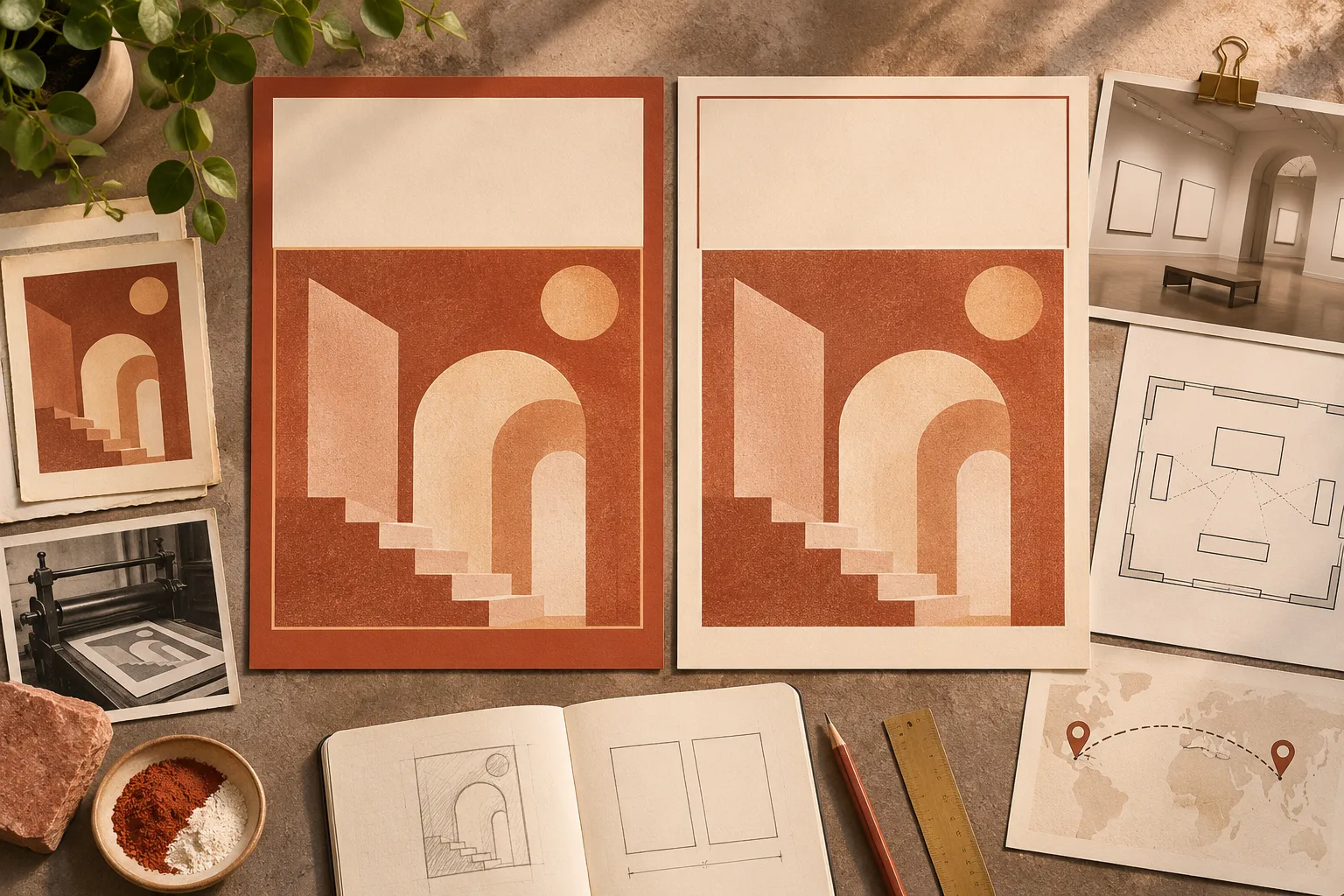
Planning illustration: keep the artwork and assign text changes separately.
| Poster element | Approved treatment | What to review |
|---|---|---|
| Headline at top | Replace “Print Fair” with “Feria de grabado” | Accent marks if required, spelling and intended wrap |
| Illustration at center | Preserve the press drawing and its position | No changed silhouette or lettering added to the drawing |
| Organizer logo at bottom | Keep original artwork or reinsert the source logo | Shape, lockup and clearance |
| Date and venue | Add approved copy in a design editor | Local date order, location and final legibility |
Spell out whether digits, units, prices, names and contact information should stay or change. Do not let the model decide them by translating the entire poster. If the audience reads right to left, plan reading order, alignment and the treatment of mixed-direction names or numbers before making variants; ask a fluent reader to check the result.
Make room for the longest line
Judge the translated headline at the size readers will see. If it will not fit, allow two lines or make more space. Do not ask the editor to squeeze a longer translation into the exact same rectangle while also keeping the original type size. An approved short alternative can work, but cutting words on the fly can change the meaning.
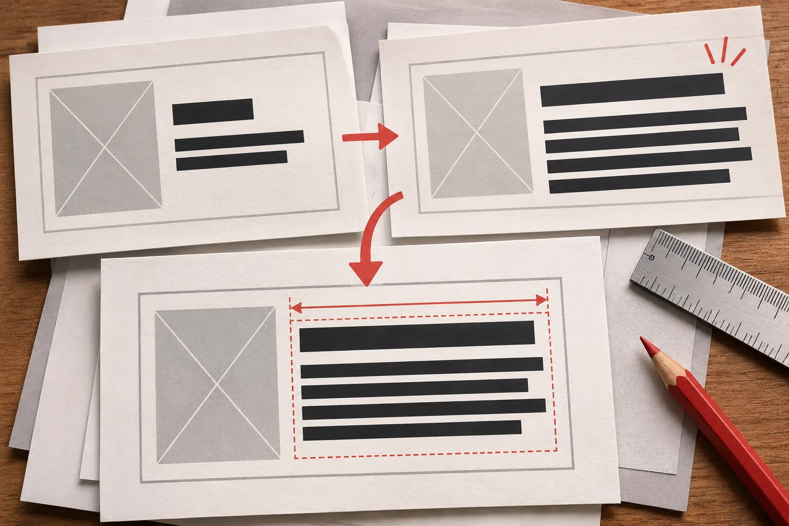
Layout illustration: longer copy may need an extra line or a wider area.
Replace only the upper headline “Print Fair” with the exact approved text “Feria de grabado”. Use two centered lines if necessary, with “Feria de” above “grabado”. Keep the existing cream headline area, orange and black palette, central press illustration, overall crop and footer layout. Do not translate or redraw the organizer logo. Do not add text elsewhere.
Run one headline edit first. If the whole layout shifts, restart from the source and specify the intended boundary. If the lettering keeps drifting, use the model to make a clean text area and place the approved words in a layout editor. That is also the better route when you need editable type, an exact font, or several languages across many sizes. For a poster starting from scratch, see the poster text guide.
Google's model card lists localized rendering across several languages as an intended use and flags small text and longer passages as limitations. This is useful context for short copy exploration; it does not establish that any given language, font, or line will render correctly.
Proofread the words and the layout separately
First, compare the output with the approved copy character by character. Look for missing diacritics, duplicated words, unintended substitutions and leftover fragments of the source language. Check the original logo against the output. If the raster artwork includes a QR code or other functional element, reinsert it from the source and test it after export.
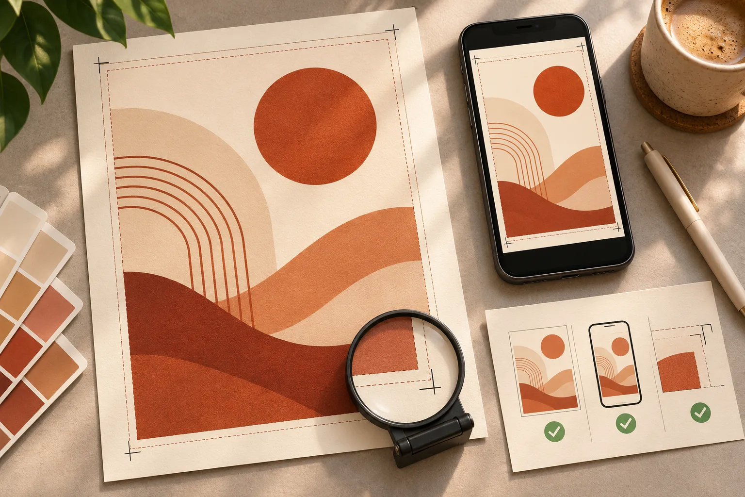
Proofing illustration: check the file at its intended display size.
Then compare the two versions at delivery size. Check that the translated title still reads first, line breaks make sense, margins hold and important artwork is unobstructed. Preview a phone crop for a social asset; for print, look at a proof at the intended physical size. Ask a fluent reader to review both wording and the order in which the poster presents information.
Keep the source artwork, approved text and editable final layout together. If you cannot approve a line confidently, leave it out of the generated raster and typeset it separately. A local-language draft can be useful long before it is ready to print.
Figures illustrate the workflow; they are not Nano Banana 2.1 test outputs. Model documentation checked November 16, 2026.